


Spain: Miracle or Artefact of False Statistics?
- Oct 3, 2020
- 1 min read
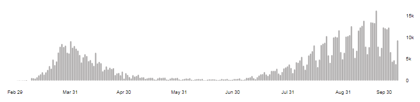

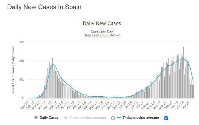

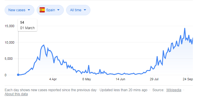
See these 3 graphs of daily new cases in Spain from 3 statistics collectors. They have significant discrepancies but reflect the same tendencies. Discrepancies demonstrate the quality of data but this is not our topic today. What do we see?
We see sharpest turn down starting September 19. This is something like what happened 1-3 of April worldwide. But now we see this only in Spain.
There are 2 possible explanations. The first is that Spain medical authorities started to manipulate with statistics. They indeed did because the Ministry of health decided to publish only data that they confirmed while the time of confirmation is about 1 week. This makes the work of statistic program more difficult and resulted in errors. But nevertheless if the tendency on all graphs is not falsified completely we see a sort of miracle – when in 1 country only the virus becomes kinder without any visible reason.


Comments